Posts

Showing posts from February, 2012

Space Analysis Form Studies

Image
Curvilinear Space Analysis by Johan Axelson I'm attempting to bring some traditional form studies from Rowena Reed Kostellow's Elements of Form into the design education at Western Washington.  These studies date back to the 1940's and the development of the original industrial design curriculum.  This is a space analysis that I did as a student of Lenny Bacich at Pratt Institute.  He was a student of Rowena's and tried to teach these very difficult form abstractions to me.  Only now that I'm teaching it do I realize what they mean and why they are so valuable.  Rectilinear Space by Larisa Schulze The forms here are done by my junior ID students.  They are not computer models, they are made with paper and wire. They have very strict rules regarding the elements used and where they can be placed.  But the intent is to expand the negative volume and create a beautiful and interesting space.  But the real goal to increase the visual and spatial sensitiviti

IDSA Design Dialogue Conference- Seattle 2012

Image
Announcing the IDSA Western Design Dialogue Conference 2012 Seattle, May 4th and 5th. And now for something completely different! Industrial designers are pushing across the boundaries of other disciplines, bringing their unique perspective, creative thinking and user centered approach to solve various problems.  Today, industrial design is influencing diverse areas such as politics, interaction, music, film, fashion, and business strategy.   At the 2012 IDSA Western Design Dialogue Conference we will explore how the role of industrial design is evolving and expanding by breaking through the traditional boundaries.  The role of design is changing in within many contexts; corporations, small firms, and the community.  We will hear from creative and inspiring individuals who are utilizing design in the unexpected places.  These will not be the usual suspects. There will exceptional networking opportunities to connect with the Western US design community.  Become part of th

The Successful Design Business Practices of Walter Dorwin Teague Part 5 of 5

Image
"We never show them sketches and never present alternatives."   Walter D. Teague Walter Dorwin Teague -photo courtesy Teague archives Be the Authority        Teague used a bold strategy with his clients, one which most consultants do not dare to do today.  When it came time to present the design deliverables, he only presented one.  It was presented with panache and great authority, usually as a beautiful and perfect full scale model, with dramatic lighting and within a contextual environment.  Teague’s perspective was that he was the designer, and he had the experience and expertise to make the final design decision.  His office had explored all possible options and alternatives, and this was the best solution.  “We work very closely with our clients, their engineers and executives, so that we thoroughly understand the conditions of success in their business.  But we consider that design is our business, not theirs.  We never show them sketches and never present

Specialized Enduro Mountain Bike Design Concepts

Image
by Kirk Turner This year in my design class the assignment was to take the 2012 Specialized Enduro mountain bike and redesign it's colors and graphics using Adobe Illustrator.  The students started with an underlay provided by Specialized and were to recreate the frame and some key components and then add reflections and shading.  It was a one week project and these are sophomore industrial design students. by Jonathan Mayfield by Rosalee Daughtry by Mauricio Romano by Leon Wolfendale by Gary Liljebeck bicycle t-shirts, stickers, iPhone cases and other gear.

Designer Cultural Understanding versus Market Surveys- Walter D. Teague

Image
  The Successful Design Business Practices of Walter Dorwin Teague Part 4 of 5  Design Research and Designer Cultural Sensitivity versus Market Surveys  ( click here for part 1 ,  part 2 ,  part 3 ) Designers at the boards in the New York Teague office. About 1940. Photo by Stowe Myers.     Teague believed in the designer’s intuitive sensitivity of culture and understanding of the client and end-user, to lead them to the best design solution.  Teague expresses the limitations of marketing and surveys in this speech in Detroit 1960: “These people can’t tell you what they are going to like three years from now- that’s been completely proven; but they can’t even tell you what they will like today if you’ve never seen it.   So the designer will learn next to nothing from the quiz programs some companies conduct at great expense.  But the designer should be aware of and sensitive to the trends that are moving in this small, communicative world of ours…. And when you fin

Star Destroyer Attacks Seattle!

Image
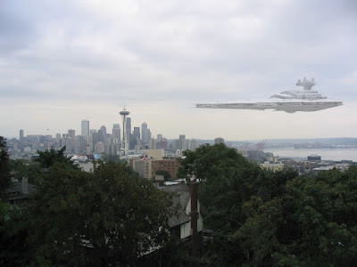
Star Destroyer visits Seattle I've been making Photoshop video tutorials for my students, and here is a short one about integrating two separate images.  Not perfect, but it illustrates the technique and was only done in 8 minutes.

Concept Art- Grappler Shark

Image
Grappler Shark by Ian Mayhew I've always admired the drawings and renderings by Ian Mayhew.  His blog post shows an interesting process animation too.   http://ianhmayhew.blogspot.com/2011/08/busy-busy.html He writes: "'Grappler sharks' live near the surface and use the eyes on the tops of their heads as light meters to camouflague their bodies to prey that swims beneath them. Though fast on their own, they prefer to sneak up on prey and latch onto it with their pharyngeal jaws before reeling it in."

The Successful Design Business Practices of Walter Dorwin Teague: part 3

Image
Part 3 of 5: Office Atmosphere and Building Alliances with Clients ( click here for part 1 and part 2 ) Figure 1: Teague drafting room, New York City, circa 1938. photo by Stowe Myers. Office Atmosphere     How did Teague run his office?  What was it like to work at WDTA during its heyday?   In 16mm film shot by partner, Stowe Myers, the 1940’s staff of Teague is shown at work and at play in their New York office studio.  Drafting desks are arranged in two long rows, all facing the front of the room, where the most senior designer or architect would be working.  The film also shows office parties, which included drinks and group singing.  It also documents a casual office art exhibition, where staff could display their personal artistic works, painting, drawing, and watercolors.  Although everyone worked rigorously, he allowed occasions for staff to celebrate their hard work and talents with parties and other creative events. Stowe Myers who worked there from 1934 to 1952 s