Color in Industrial Design (part 3)
Color as form emphasis
Color can be used to emphasize the physical form, and to enhance the surface variation or three-dimensionality. This application is not dependent upon culture, but rather is based on how our minds process visual information. Our eyes equate value variation with surface variation. When this variation is pronounced through color its three-dimensional form is enhanced.
 |
| comparing similar forms with high and low value colors. Photo by Jason Morris |
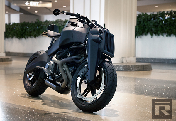
Considering the range of value possible on a form’s surface, more contrast can occur with light (high value) colors, especially white. However, a dark color such as an 80% gray has only a small range of value to exhibit until it’s fully black. So the perceived value change is small. The example below shows how the value change in the white bumper exhibits its curvature. However the dark blue bumpers curvature is hard to see, since its value remains mostly constant and is confused by reflections.
Figure 6. Comparison of gloss white with gloss dark blue to enhance form
Metallic pigments can enhance this contrast by reflecting more light at its highlights and extending those highlights further. Metallic pigments also darken the values at the shadows. This is especially evident in car paint colors, where it is used to reveal the vehicle’s surface contours. One can compare a metallic orange with a non-metallic orange of the same value and observe the difference.
 |
| Figure 7. Comparison of metallic orange (left) with non-metallic orange (right) |
6. Color as form alteration
This application of color alters the three-dimensional form by concealment or disguise. An extreme example is camouflage on a military vehicle. The purpose is to break up the form visually and to change its visual boundary, thereby causing the mind to not recognize its true form. The changes of value in the color are contrary to the change of surface. This application may be used in design to hide or conceal a feature of an object, or to de-emphasize a form. The example below utilizes high contrast color graphic treatment to obliterate the perception of it’s three dimensional form.
 |
| Figure 8. Using graphic color treatment to obliterate a form |
 |
| Figure 9. F117A Nighthawk matte black finish absorbs light and RADAR |
On a matte black surface it is very difficult to read its form since the value change is minimal. This is true of any hue of low value. The F117A Nighthawk stealth fighter aircraft takes advantage of this aspect by using a matte black finish that not only absorbs light, but also RADAR wavelengths. It becomes very difficult to distinguish its form, especially at night, when it performs its missions. (Airforce-Technology)
7. Color as material emphasis
Color may be used to celebrate a material’s properties, rather than hide them. This is used when the material make up is valuable or has exemplary properties to be emphasized. Jewelry designers do this naturally with precious metals and gemstones. The polishing of gold brings forth its luster and richness. The precise cutting of rare gems highlights their natural color and refractive properties.
8. Color as material deception
The application of color can be used to deceive the viewer of its true material make up. This is especially useful where the faux material is too expensive or impractical to be used in low cost, high volume production.
Station wagons in the 1930’s were truly built with hardwood doors and side panels. They were also quite prestigious and expensive to own. The wood had to be hand cut and fit. And, the maintenance of varnishing and adjusting bolts due to expansion was tedious and time consuming. By 1953 automakers ceased using real wood and used all steel body panels. The 1955 Ford Country Squire achieved a wood aesthetic using simulated wood grain made of vinyl. And even today one can buy an aftermarket wood grain application kit for most any vehicle on the road. (Narus)
 |
| Figure 10. Material emphasis as real wood car doors versus material deception as exhibited in simulated wood grain printed on vinyl. |
A more common example is the current mobile phone designs available. Most have simulated metallic finish, either to represent a polished aluminum or brushed stainless steel, even though the actual material is an injection molded polymer.
Next up: Color as harmony versus contrast, plus ideas on how to make color come first...

Comments